Wikipedia Clickstream Visualization

The Wikimedia Foundation has recently released Clickstream data.[1]
This is the data that shows the "clicking around randomly" effect we're all familiar with when browsing Wikipedia.[2]
I tried to do some initial clustering analysis on it, but thought, for the time being, it might be more fun to do a pure data visualization application instead, and let people click around for themselves.
Here's a screenshot while still in development:
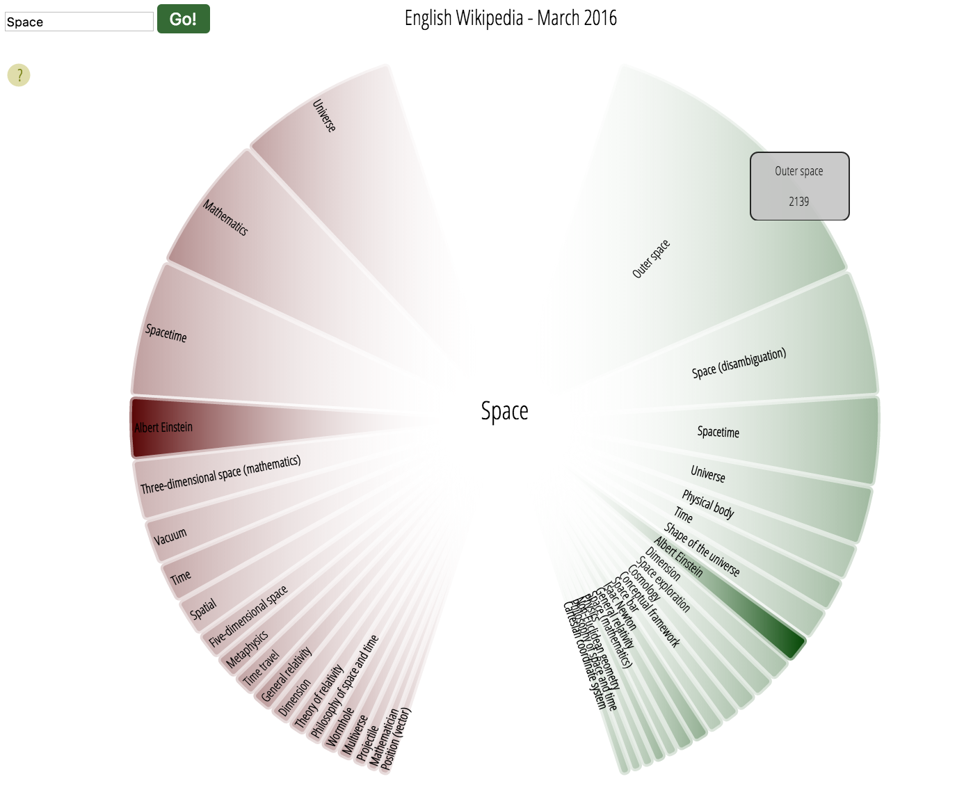
The wedges on the left show the incoming links, while the wedges on the right show outgoing links. The size of the wedges shows the amount of clicks going in that direction relative to the others. The darkness of the color shows how popular that article is overall.
Because this exploration requires a back-end as well (to serve up the data), I've spun up a special server to host it and possibly other such projects.
I'm not sure how much of those I'll do, or even if I'll keep the server running for long, so, if/when I take it down, I'll leave a 'static' version here.
It's enough to get the gist of it, and once it's more polished, I'll factor out some of the personal information (Google Analytics, Paypal, etc) and host it on github.
"Live" visualization (link unstable)